Strategical re-branding of Parex bank, delivering a smooth transition into the largest legal recovery and distressed assets management company in the Baltic states.
The new brand name and its graphical representation both reflect the company’s transition to a new mission and the turning point of the company’s value recovery. Two elements of the name — “Re” and “verta” — refer to the Latin equivalents for “value recovery”.
The final logotype is the result of extensive research on typeforms that included multiple options ranging from light to bold, severe to soft and friendly, with several colour options for each one.
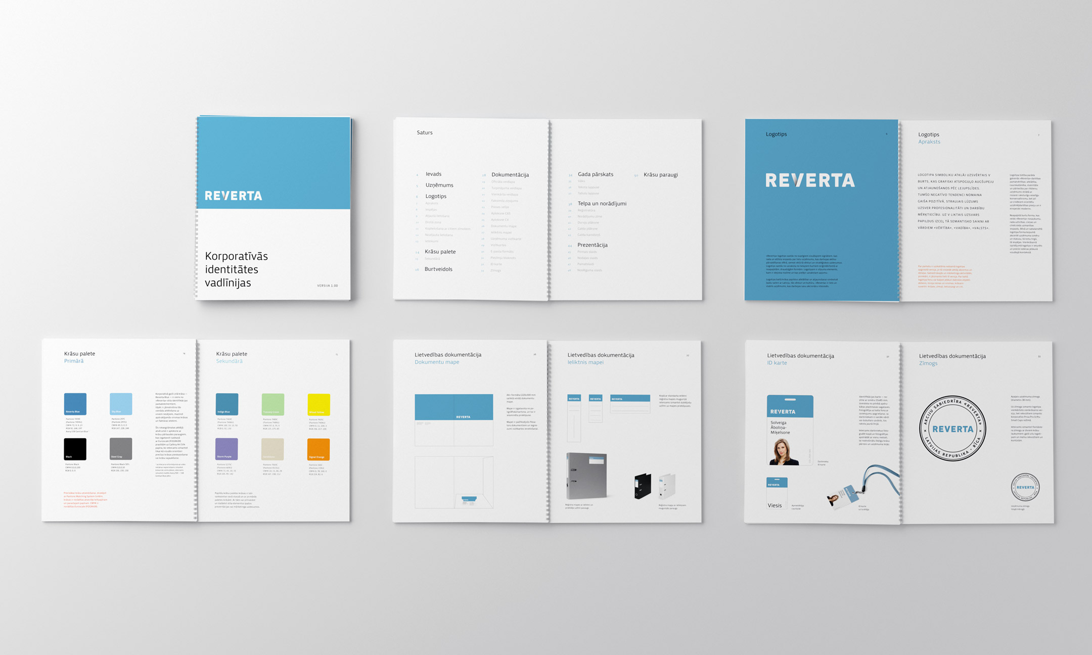
We developed detailed visual identity guidelines in three languages: Latvian, English and Russian. The guidelines contain descriptions and rules for usage of the basic corporate style elements including the logotype and its versions, colours, typefaces, stationery layouts and elements of wayfinding.
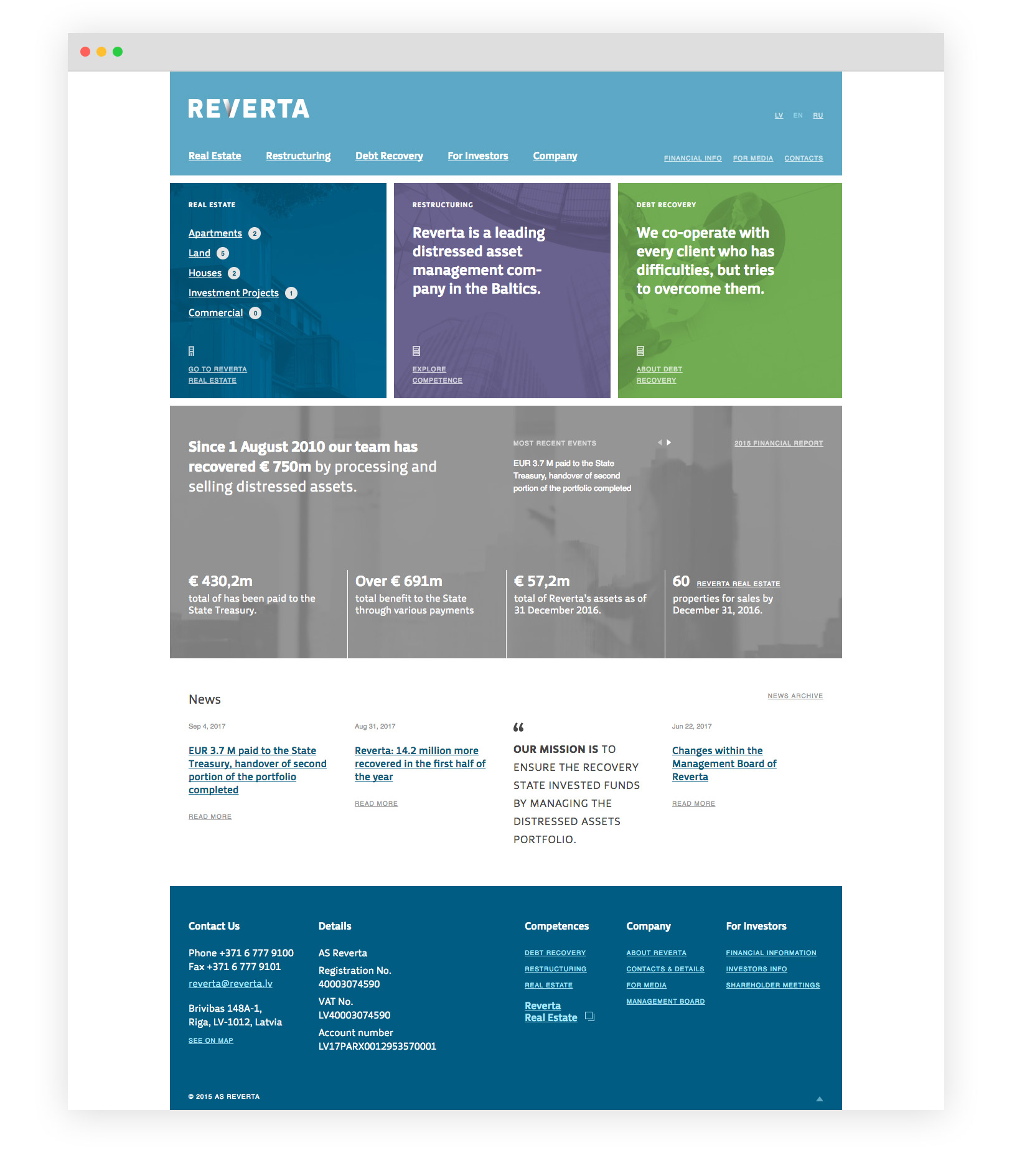
The design of the Reverta website continues the corporate visual identity with its clean and grid-based typographic layout, making contents of the website appealing and legible. The website includes the Reverta asset portfolio, the catalogue of Real Estate objects, as well as actual information on company progress.