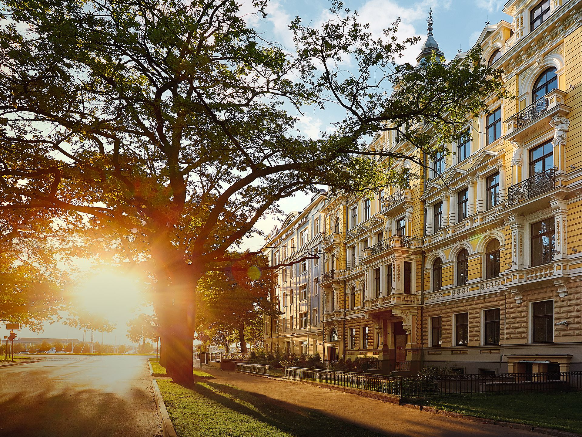
Visual identity set, multiple editorial pieces and web presence for a century-old splendid residence in the Embassy District of Riga, Latvia, forming an exceptional image of a premium realty object on the market.
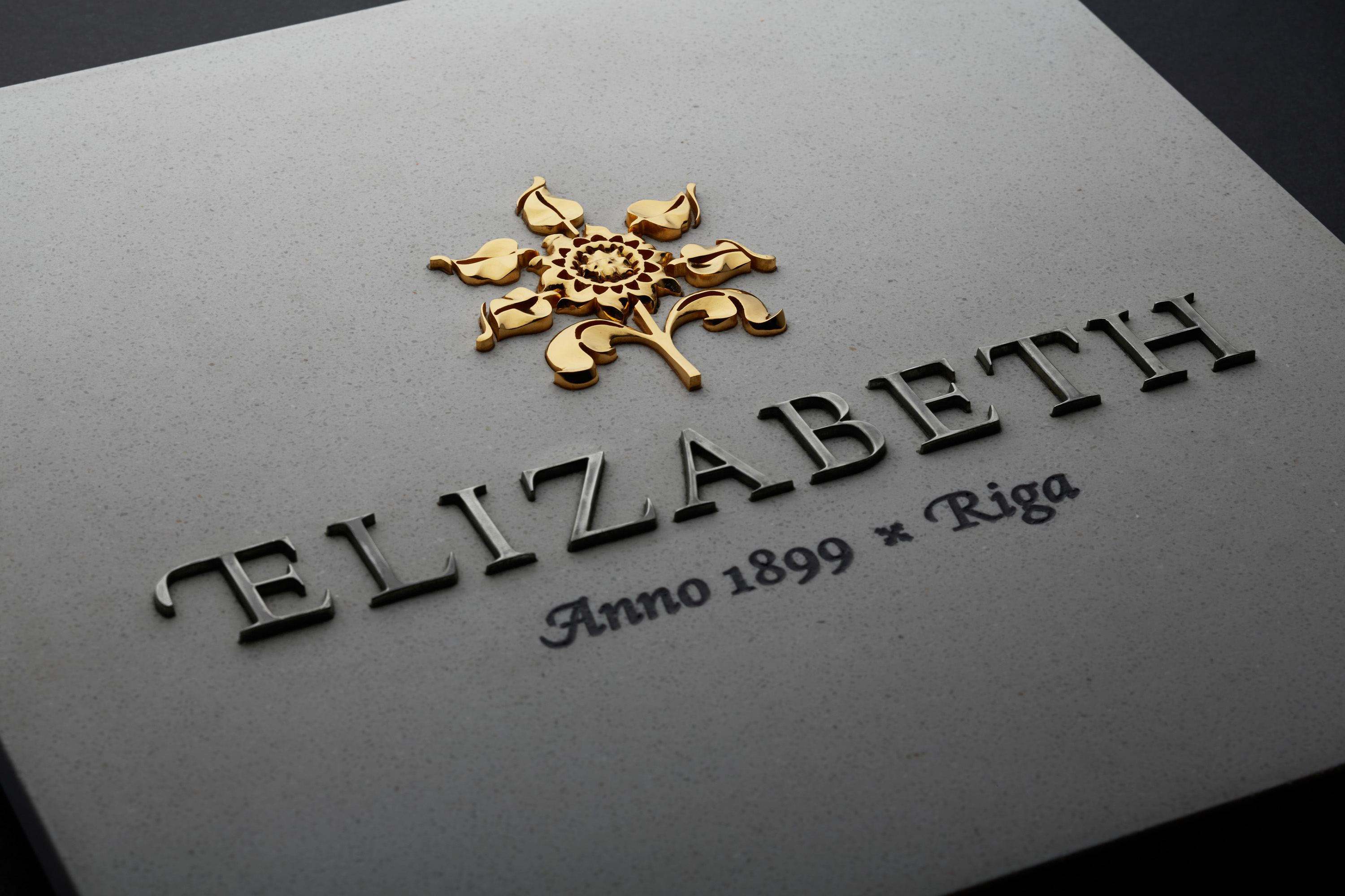
During our research we discovered forged sunflowers in the metal fence of the balcony of the richly decorated façade of the Elizabeth building. This finding inspired the logotype and became the graphical and metaphorical symbol of the house: being turned to the south, its façade, just like the sunflower, follows the sun throughout the day.
The elegant title of the building and the descriptor was set in a matching customised typeface.
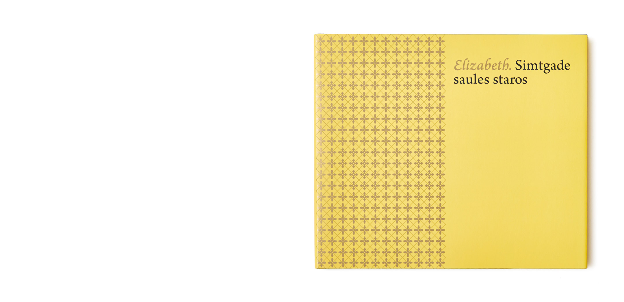

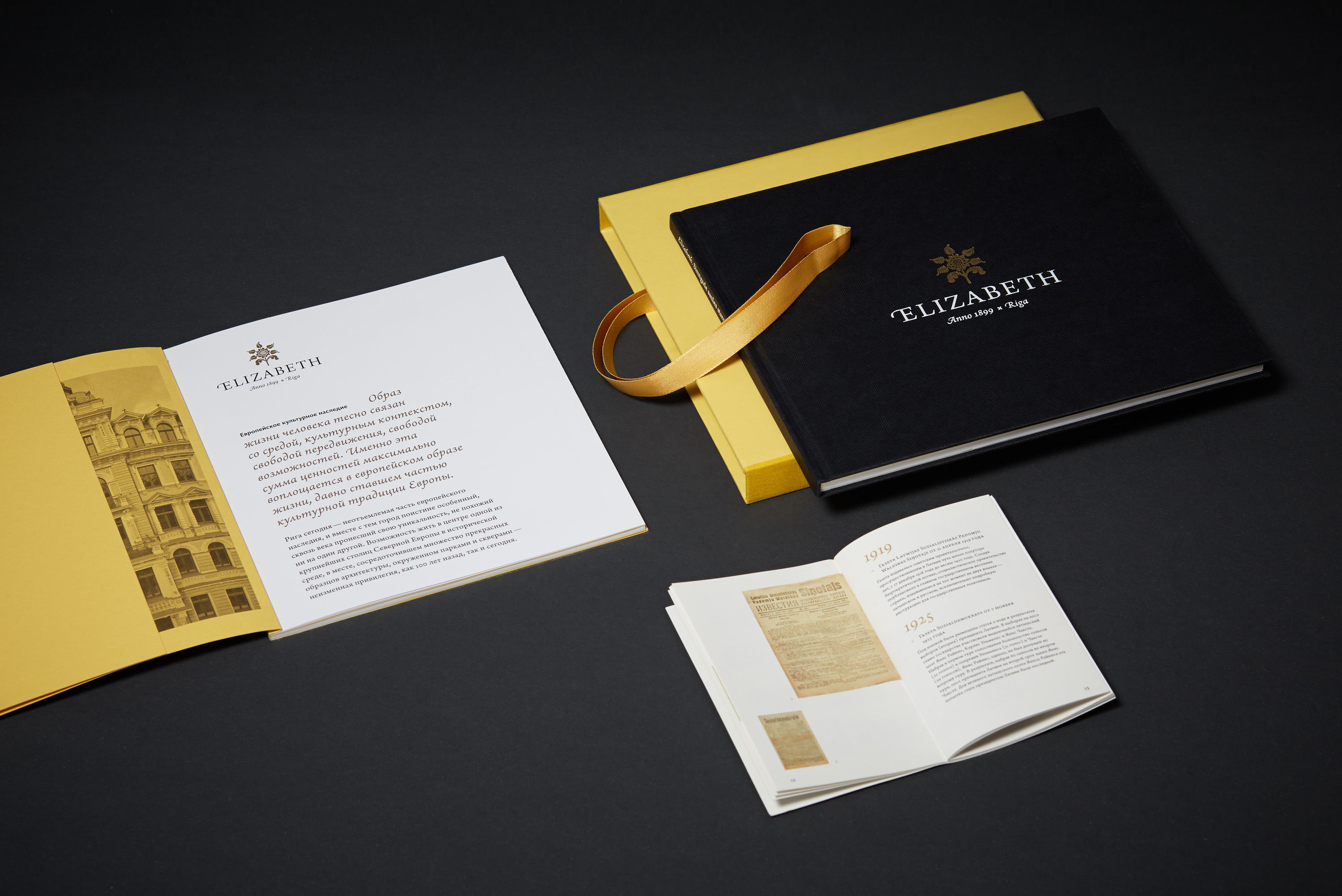
The “Elizabeth” book, commercial brochure and the “History in Details” brochure forms the integral editorial set published for the purpose of promotional and selling activities.
All of the items share the same typographical and layout features and paper stocks.